Design highlights
TI.com homepage redesign

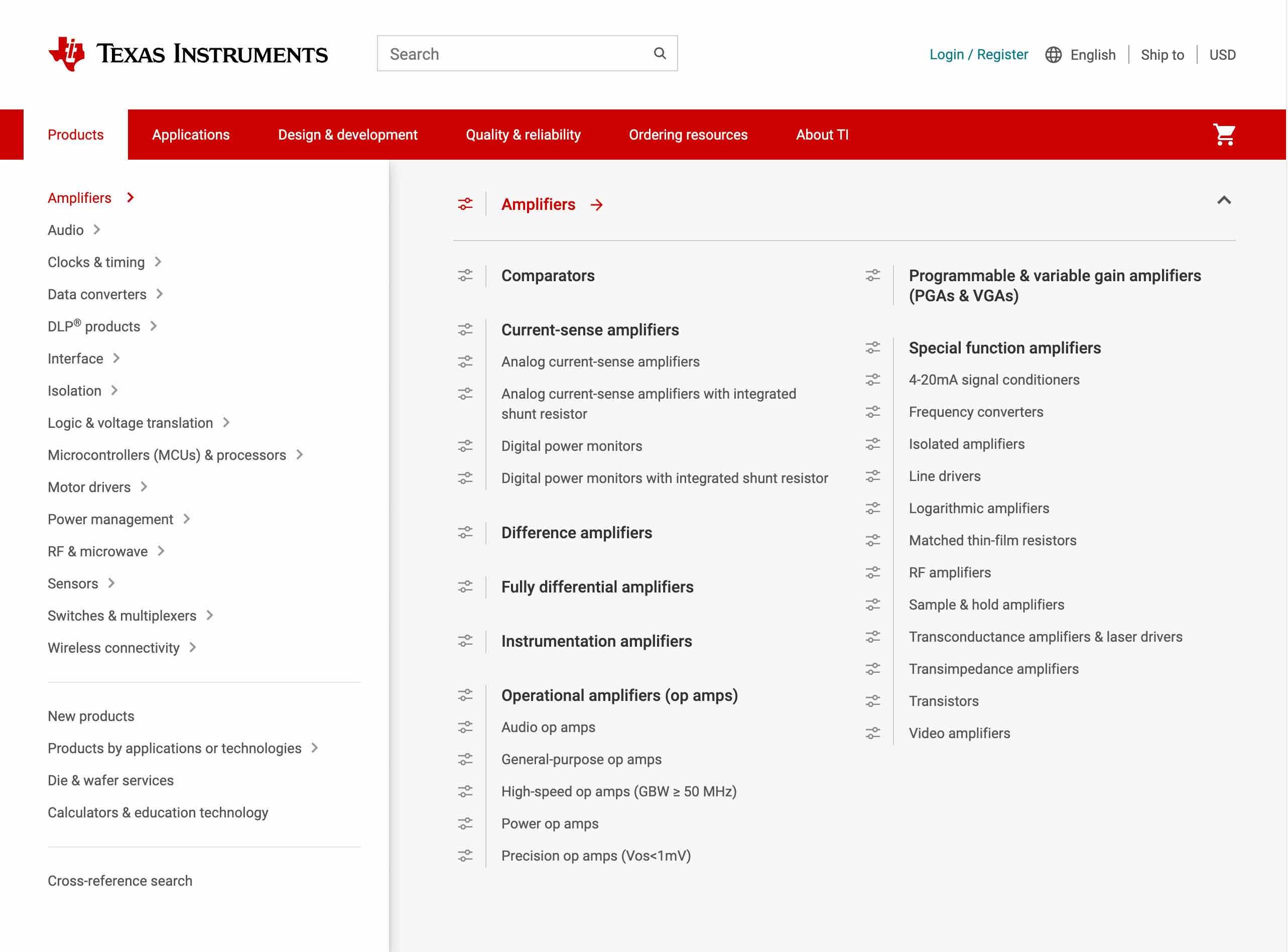
Megamenu design

Product family portals redesign

My work with Texas Instruments began as senior UXD leading the team into new territory, designing for the user instead of the stakeholder.Through design thinking approaches, building out a design system, and bi weekly sessions for designers to showcase their work and problem/solutions to their peers. There isn't much on the existing website that I haven't had my hands on including the Megamenu and the redesign of a very complicated ecommerce experience.
Website
Texas Instruments, a semiconductor manufacturer, has over 100,000 products, multiple organizations, portals, and technologies – each with their own content models, navigational priorities and Users. In 2021, Jonathan modernized the navigation experience by designing a global Mega Menu, this allowed users/customers to drill down within the complex product and applications trees with ease from anywhere on ti.com.
User Testing provided the qualitative information for fine tuning the component and surveys confirmed that the Users (Engineers) felt the new navigation reduced the frustration experienced when looking for multiple products. Metrics showed increased engagement compared to the previous navigation which only allowed the customer to drill down one level.


